A Virtual Artist Walkabout with Gitte Möller
Gitte Möller’s art works speak through a language of symbols. Borrowed from sources as varied as Medieval decorative motifs and 90s subcultures, the objects in her art are taken out of context and placed floating in rooms inspired by the interiors of video games, like clues to clocking the next level. Disembodied anime wigs play suspended witness to something that has just happened or is about to. Nothing is out of limits for Gitte whose tools and materials range from Photoshop to oil paints to horse stickers. You’ll find Clipart in her oil paintings and her digital artworks printed onto perspex sculptures.
In our second virtual artist walkabout, she decodes 5 of her most recent works, two of which you can currently see in the Close Encounters group show at Smith Gallery in Cape Town.
Look out for her solo show at the beginning of 2019!
1. I am loved less than I love (2018)

When I found the horse stickers, I thought that the best way to use them would be isolated on a dark background. The horse stickers (like Hello Kitty or Barbie cakes) embody something about being innocent and young that now seems impossibly remote to me, like it almost never even happened. I’m often most comfortable with this kind of imagery because it lets me talk about my feelings while guarding them through something very familiar and ubiquitous.
I almost always title my work after I’ve made it, and this title, I am loved less than I love is a quote I borrowed from A lover’s discourse by Roland Barthes. The sentiment immediately reminded me of this scene, of the one horse watching the other run away.
The painting was done with oils (except for the horse stickers) on a kind of synthetic paper called Enduro Ice. Besides physically framing my work, I also like to paint faux decorative frames onto the actual painting, which helps to amplify the way the picture draws you in.
2. Nothing is forever (2018)

I’ve been trying to figure out how to paint the things I wanted to paint into a space which wasn’t a conventional landscape or interior. I felt like I needed something more artificial to complement (rather than undermine or over-exaggerate) the non-naturalistic qualities of the symbols and objects I was painting. I began looking at screenshots from 90s computer games I used to play like Tomb Raider 2, Doom, Wolfenstein etc. and was really taken by the kind of dungeon-like subterranean spaces in these games. These spaces have a very strong emotional quality for me because of their harshness, the sharp lines and the extreme flattening of detail. The perspective of space in these games is also similar in some ways to old Gothic paintings I had been looking at. I feel more excited now about the evocative possibilities of perspective in painting, whether it’s ‘correct’ or warped perspective or a combination of the two.
I think of the disembodied anime hair that I frequently use as a ghost or trace of a person. If the image needs something anthropomorphic I’ll use the hair to establish some kind of semi-human dialogue with the other objects in the space. In this work, the hair has a view into the room, but it’s not clear whether it plays the role of witness, victim or aggressor with reference to the blood on the floor.
3. It is impossible to eat with disgust and pleasure at the same time (2017)

This is a digital print which started out as a Photoshop sketch I made for an oil painting. Once the painting was finished I went back to the sketch, cleaned it up and sold it as a print. Again, I brought in the hair to add a human element to the painting (I think this was actually the first time I used it). The title for this work is a quote from Freud (who I read quoted somewhere else) and it seemed like a good crystallisation of how I felt about this image. One of the things I really like about making pictures is that there is the possibility of capturing in one single image a wide range of feeling, and by extension contradictory feeling states (which might otherwise be difficult to reconcile).
4. No fear/It was not a bad life (2017)

I borrow a lot from images I find online and many of my paintings are essentially collages of these images taken out of context. Here the No Fear logo (a clothing brand from the 90s) is hovering over a Clipart image of a church.
The symbols in this painting remind me of my upbringing in the northern suburbs of Cape Town, although I’m sure these things are familiar to a lot of people my age, but from different backgrounds. I suppose a lot what I thought of as my culture when I was young I later realised was clearly borrowed from somewhere else, which is part of the reason I feel comfortable making historical and cross-cultural references. The meaning of something can change very drastically according to context in real life and I think the same is true of painting.
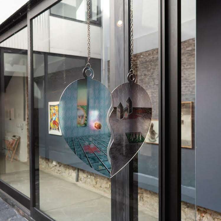
5. Untitled prototype (2018)

This was a prototype for the heart necklace work. I had been trying to come up with more interesting ways to display the digital works. I think that turning the digital work into semi-sculptural objects draws more attention to the organic and painterly characteristics of the image (as opposed to viewing them on a digital screen). This particular digital sketch was made in Photoshop and is roughly based on a screenshot from this part in Tomb Raider 2 where you have to dodge these spiked walls that are closing in on you.
More at gittemariamoller.com.
Follow Gitte on Instagram for more.
